Introduction
MoreNiche is an Affiliate Network based in Nottingham, UK, that specializes in the health and beauty vertical. The company's goal is to generate client ROI and operates with a different model compared to most traditional affiliate networks.
As the industry evolved, the need for an updated and user-friendly web app platform became crucial. To meet this need, a redesign of the web app was undertaken, with the goal of improving the user experience and making it easier for users to navigate and access the information they need. This case study will detail the redesign process, including the research and design decisions that were made, and the impact that the redesign had on the overall user experience. The redesign aimed to create an intuitive and simple interface that would take the work out of the users' hands and allow them to easily access the information they need, ultimately increasing the chances of success for all parties involved.
My Role
My role during the redesign process of MoreNiche's web app was to lead the design efforts and ensure that the final product met the needs of the users. My responsibilities included:
- Conducting research: I had to gather information about the current interface, users' needs and pain points, and industry trends to inform the redesign process.
- Designing the interface: Use design principles such as layout, typography, and color scheme to create an aesthetically pleasing and intuitive interface.
- Collaborating with the development team: Work closely with the development team to ensure that the design is feasible and can be implemented within the given constraints.
- Usability testing: Conduct testing to validate design decisions, gather feedback, and identify areas for improvement.
- Iterating: Use feedback and testing results to iterate on the design and make improvements as needed.
- Communicating with stakeholders: Keep stakeholders informed throughout the design process and present the final product to them for feedback and approval
Overall, my role as the product designer was to lead the redesign process, ensure that the new interface met the needs of the users, and create an intuitive and simple interface that would take the work out of the users' hands.
Competitive Analysis
As part of the redesign process for MoreNiche's web app, a comprehensive UX competitive analysis was conducted to compare the user experience on the platform with that of other market leaders in the affiliate marketing space. The goal of the analysis was to identify best practices and areas for improvement in the redesign. We researched a host of platforms such as Rakuten marketing, Commission junction, Share sale, etc. and we discovered certain areas where we could focus on improving during the redesign.
We discovered that navigation on affiliate marketing platforms could be improved to make it easier for users to find the information and tools they need. This could include implementing a more intuitive menu structure and providing a search feature to find specific features or products. Additionally, we discovered that customization options for affiliates could be improved, allowing them to create unique links and marketing materials that better reflect their brand.
Also, we noticed that user education materials on affiliate marketing platforms could be improved. By providing more detailed guides and tutorials for new users, it would help them understand the platform and get the most out of it. Furthermore, we discovered that reporting and analytics tools offered by affiliate marketing platforms could be enhanced, and more detailed data visualizations provided to help users better understand their performance and optimize their campaigns.
Additionally, we observed that the mobile experience of affiliate marketing platforms could be improved, allowing affiliates to access and manage their campaigns on the go. We also discovered that the speed and performance of affiliate marketing platforms could be improved to ensure that pages load quickly and that users are not faced with long wait times.
Lastly, We discovered that User Feedback Systems, Personalization, and Communication could be areas of improvement in Affiliate marketing platforms. These features if implemented, would help to improve the overall user experience.
User Personas
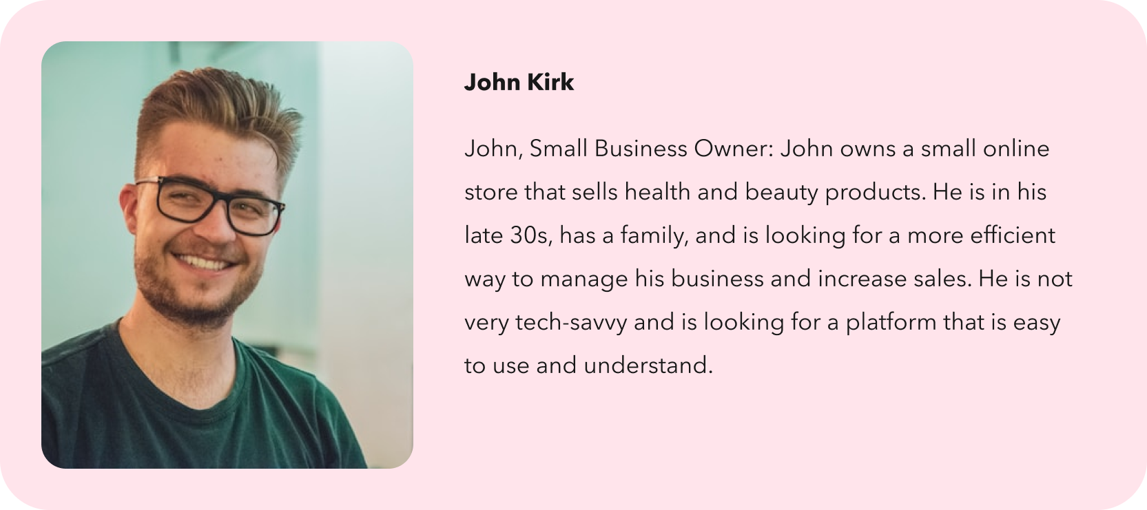
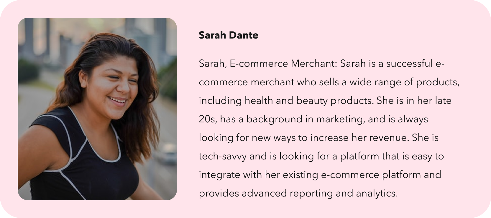
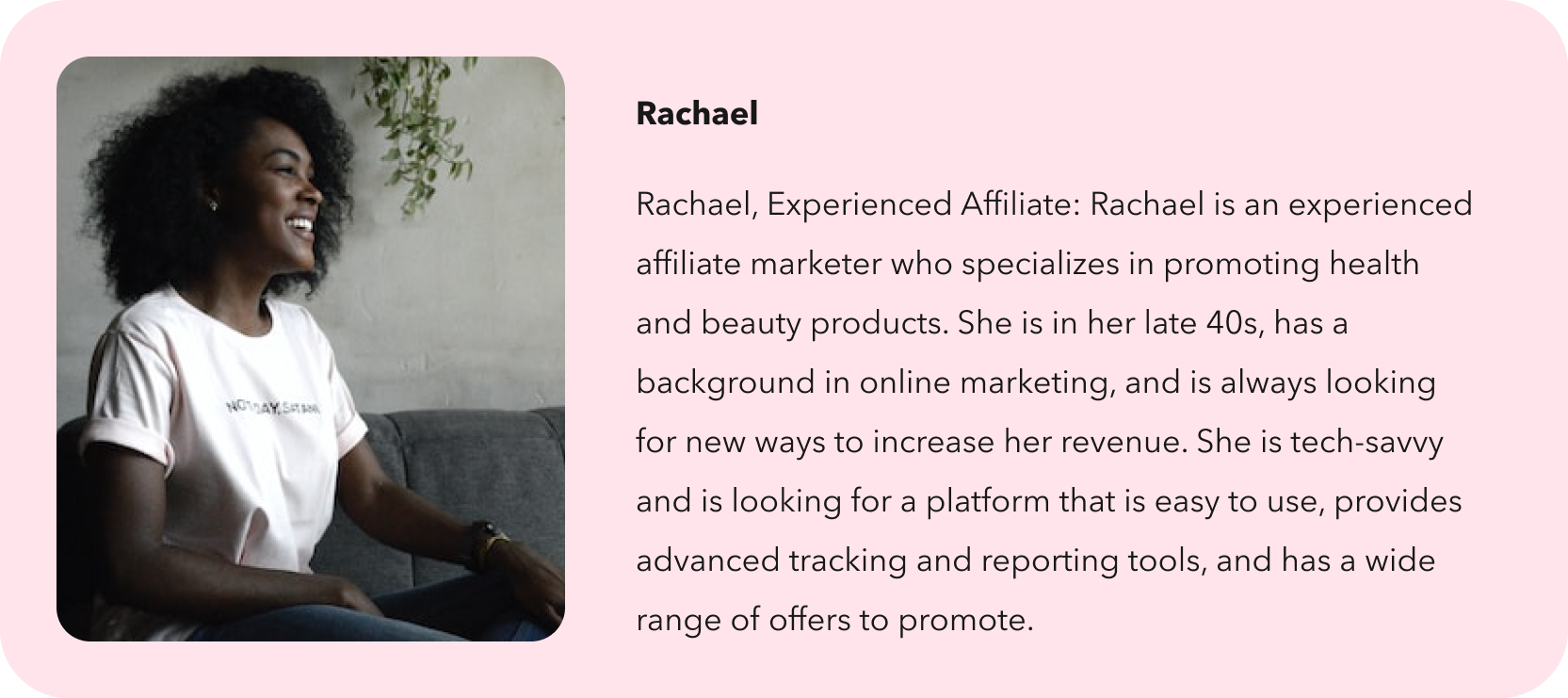
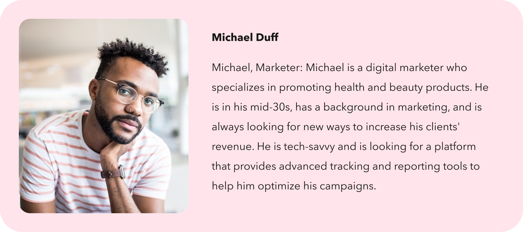
For the redesign attempt, we created user personas to represent the different types of users and their needs. These personas helped us understand the different types of users that would be using the platform, including small business owners, e-commerce merchants, marketers, and entrepreneurs.
We also considered demographics such as age, gender, location, and occupation to make sure that the redesign would cater to a diverse set of users. By creating user personas, we were able to identify the specific needs of different segments of our target audience, which helped guide the development of our solution and ensure that it would meet the needs of the majority of users.
Additionally, we observed that the mobile experience of affiliate marketing platforms could be improved, allowing affiliates to access and manage their campaigns on the go. We also discovered that the speed and performance of affiliate marketing platforms could be improved to ensure that pages load quickly and that users are not faced with long wait times.
Lastly, We discovered that User Feedback Systems, Personalization, and Communication could be areas of improvement in Affiliate marketing platforms. These features if implemented, would help to improve the overall user experience.
UI Designs
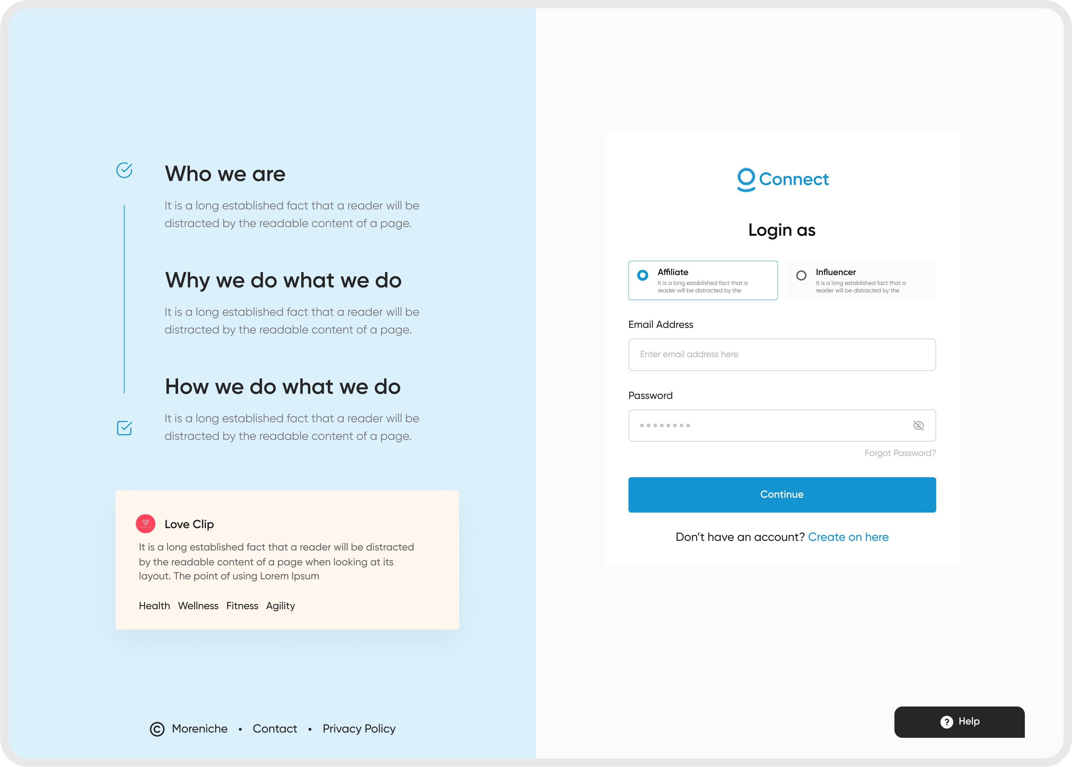
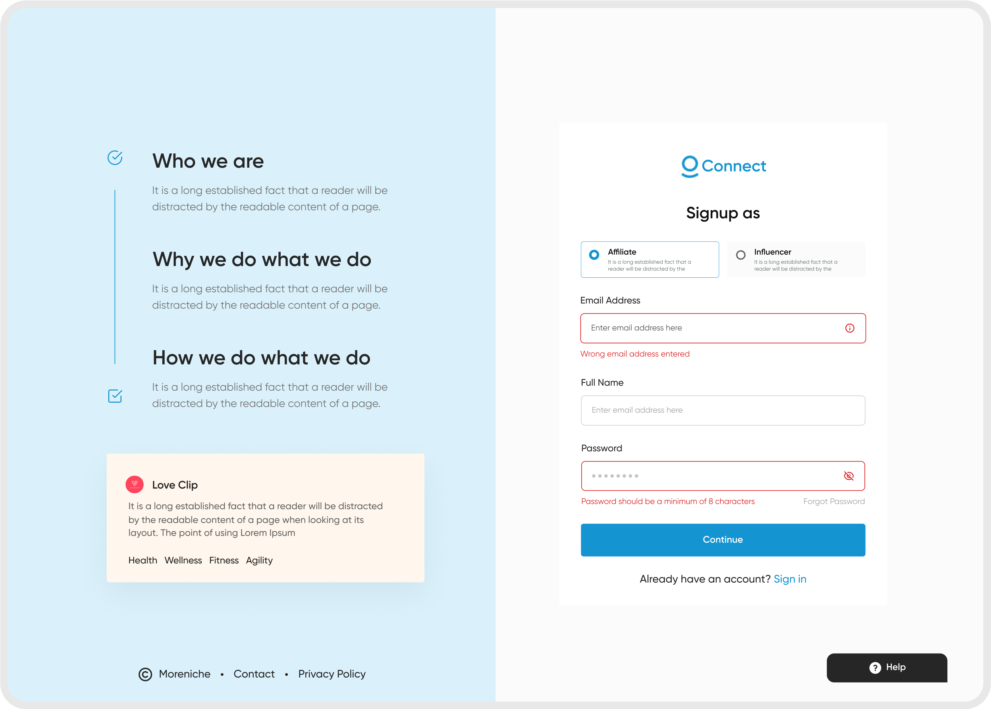
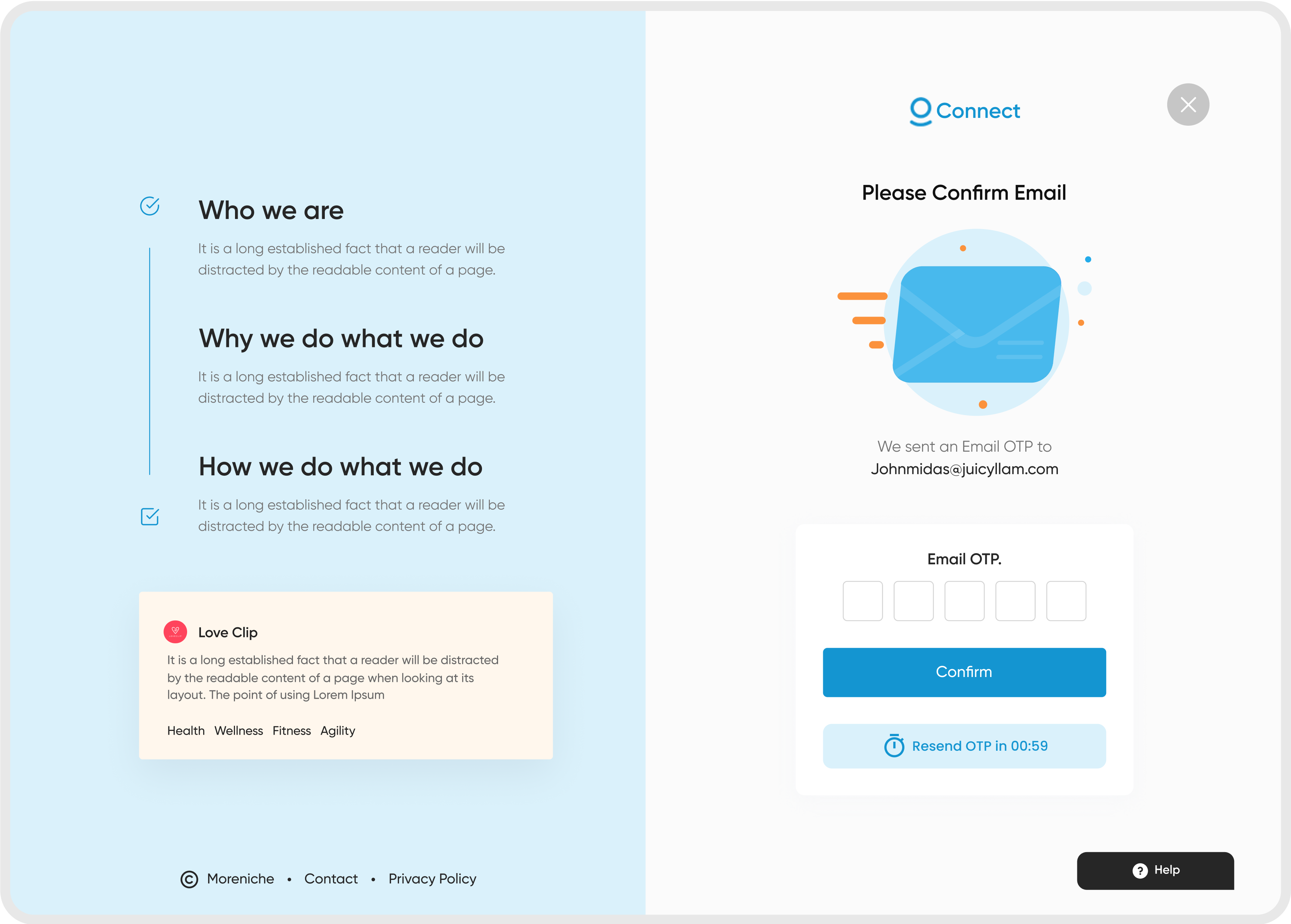
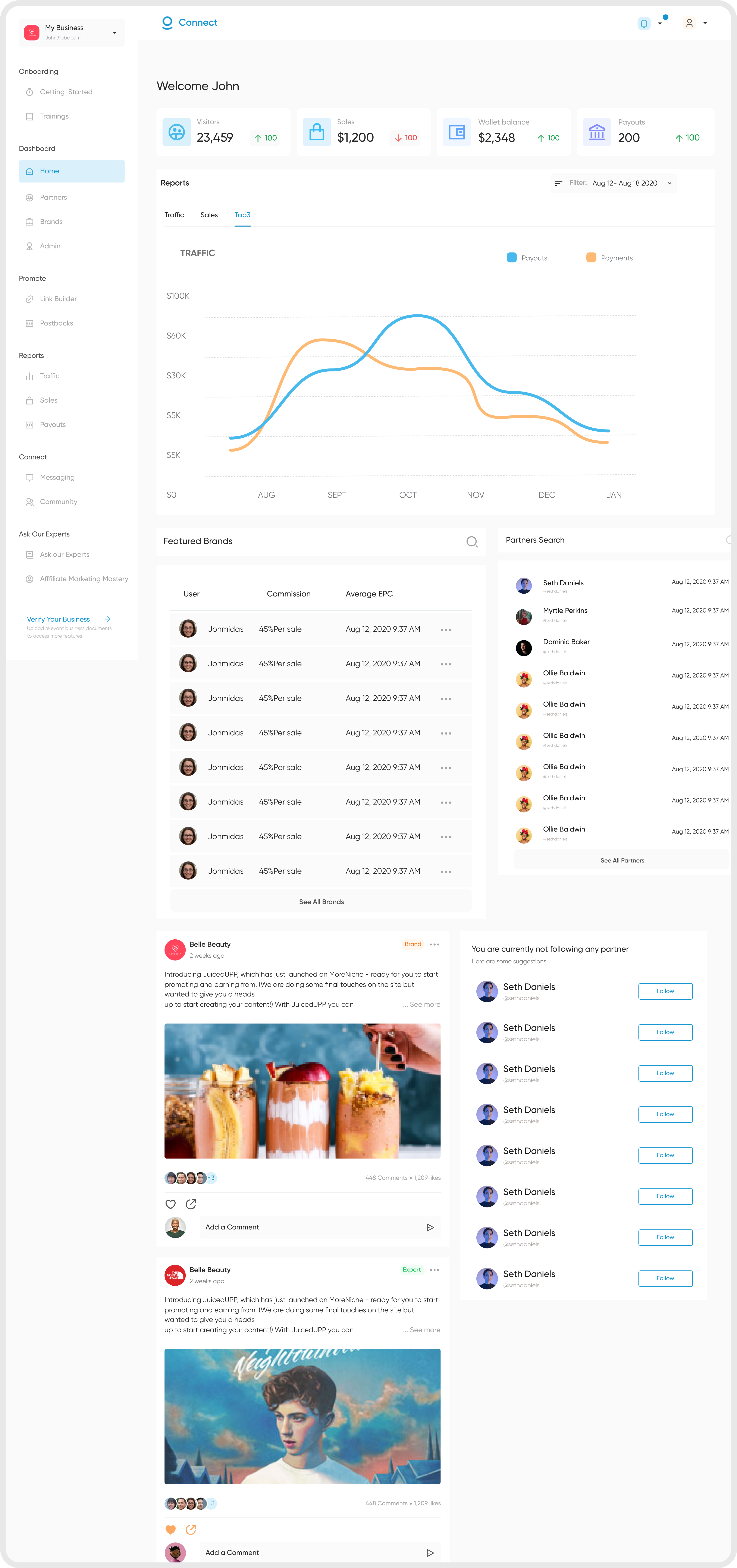
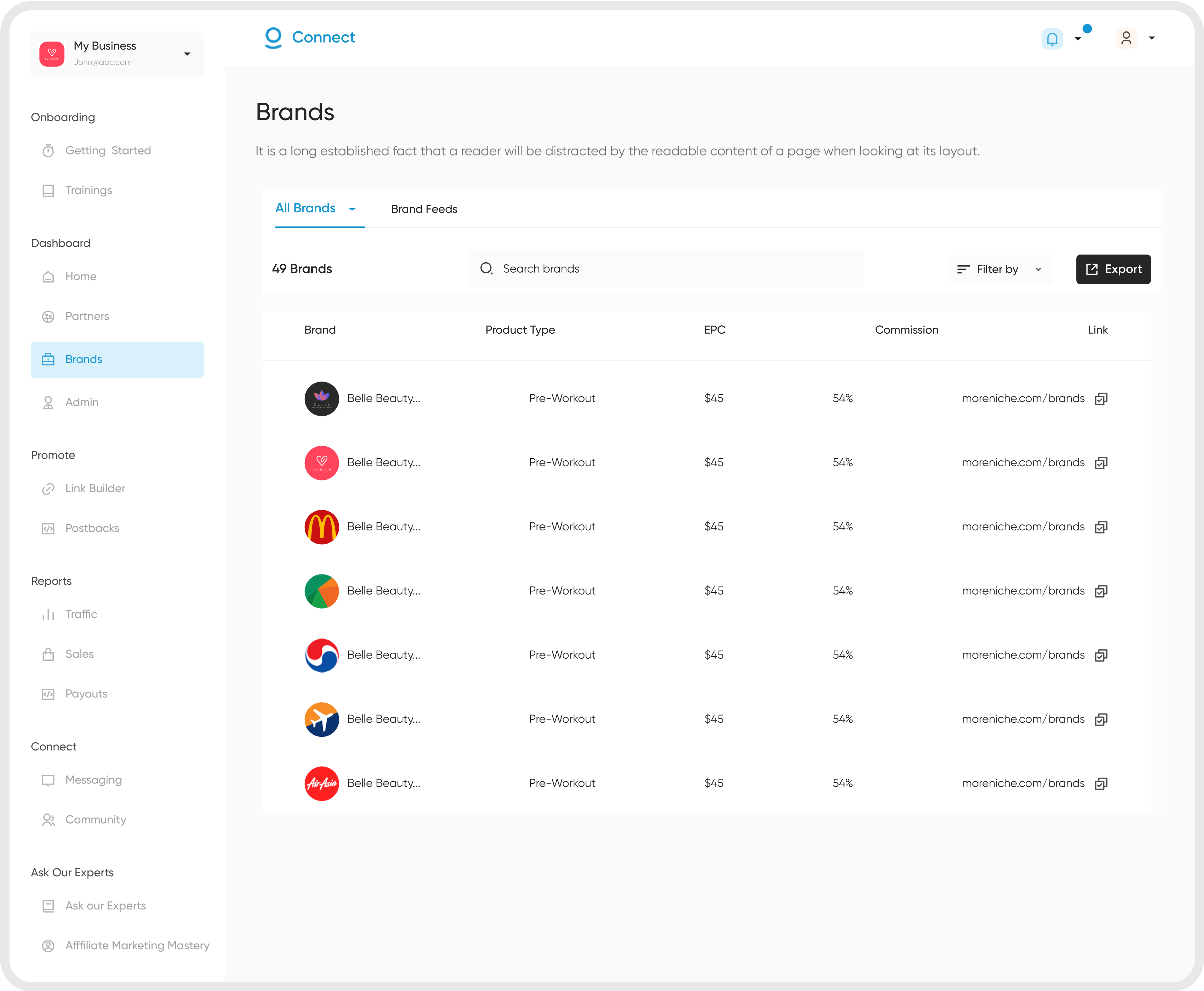
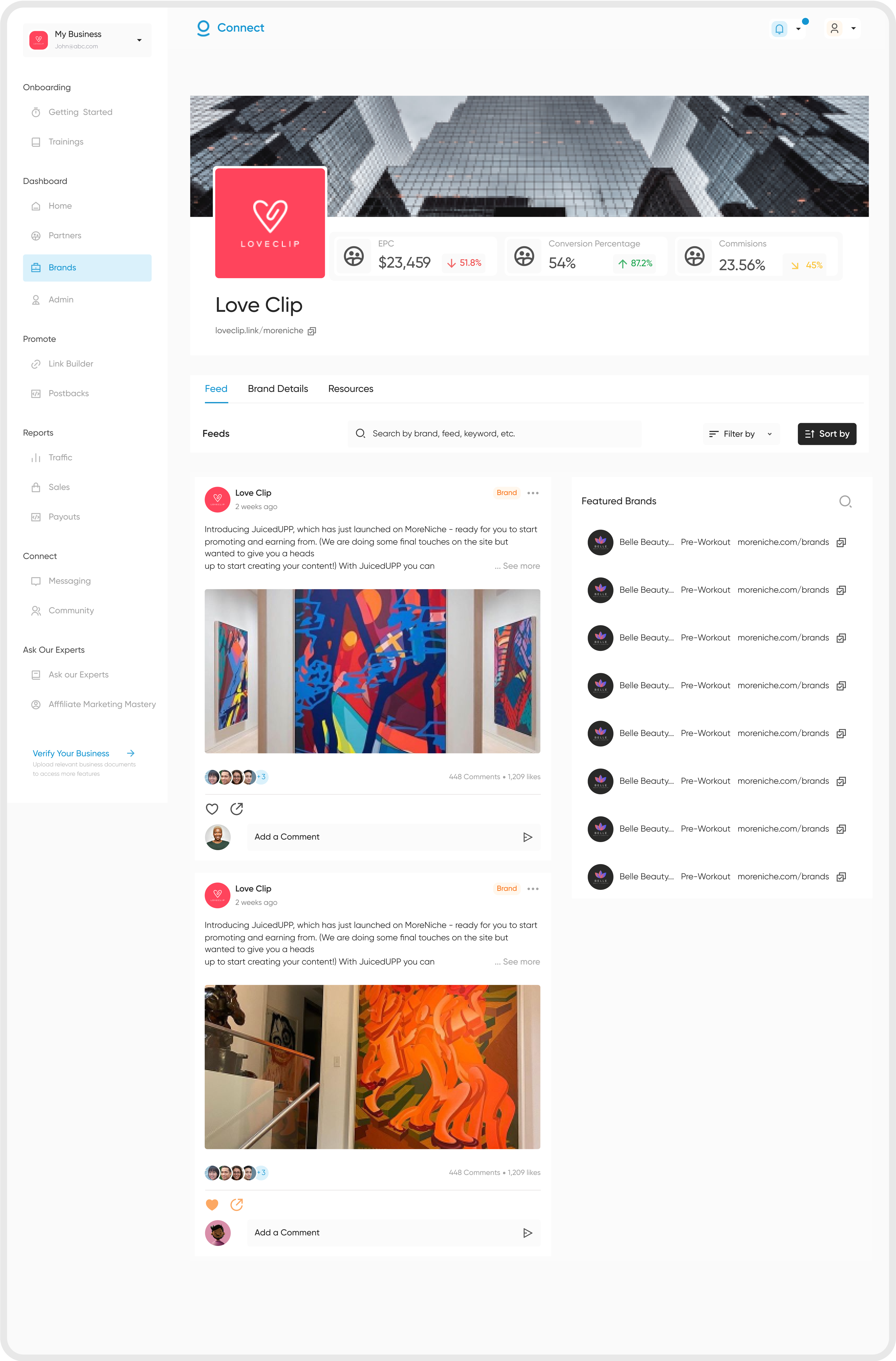
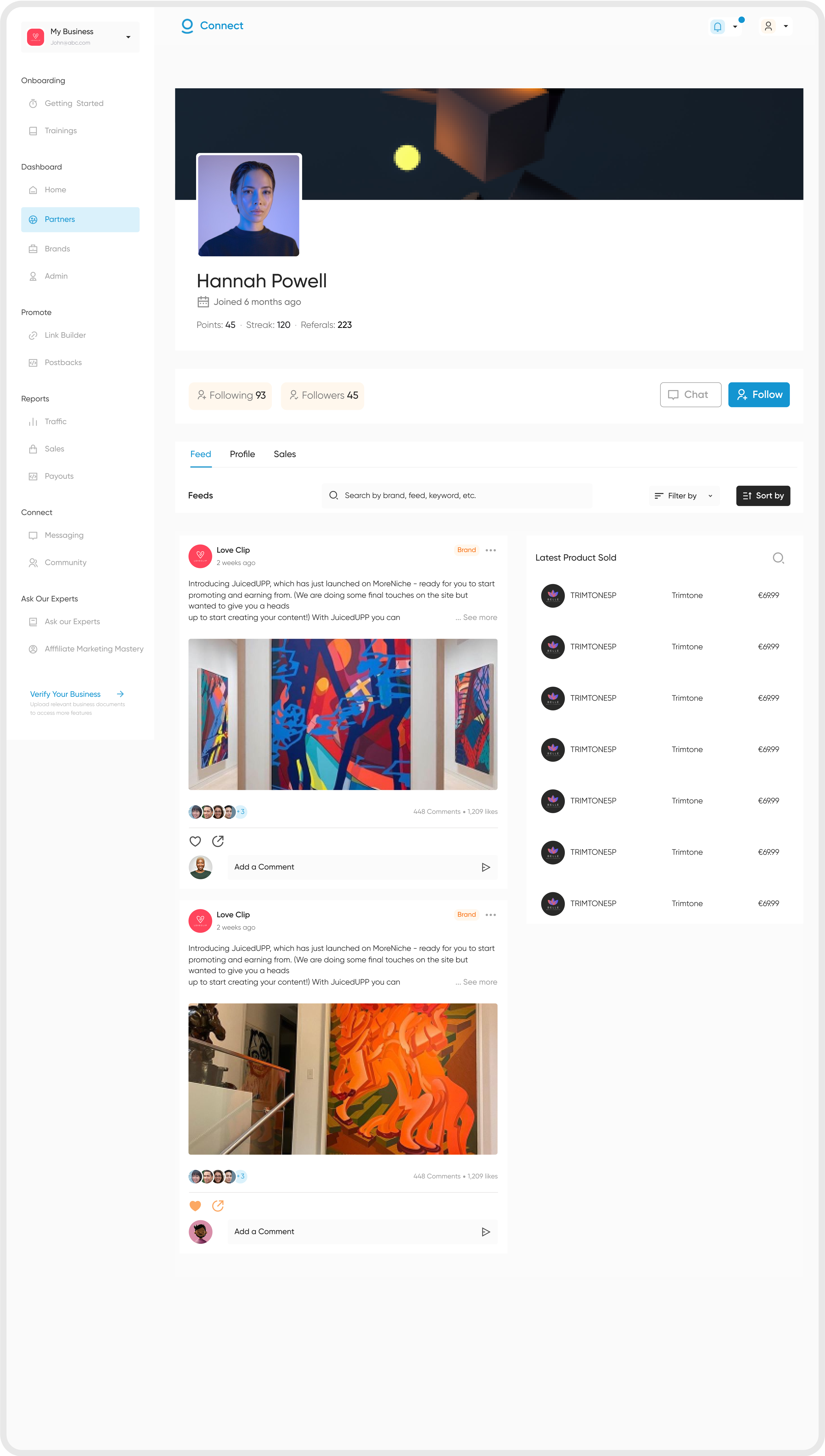
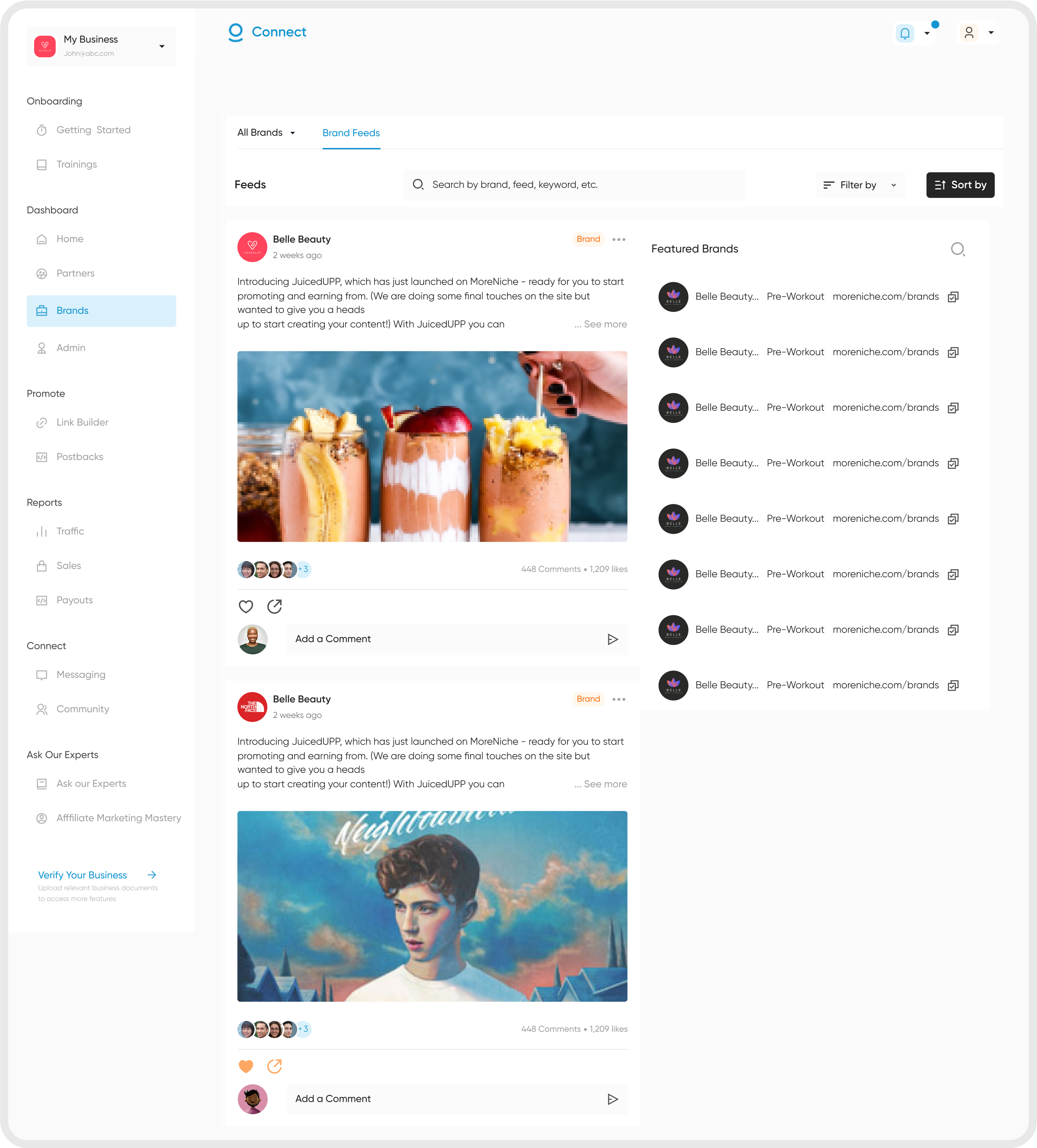
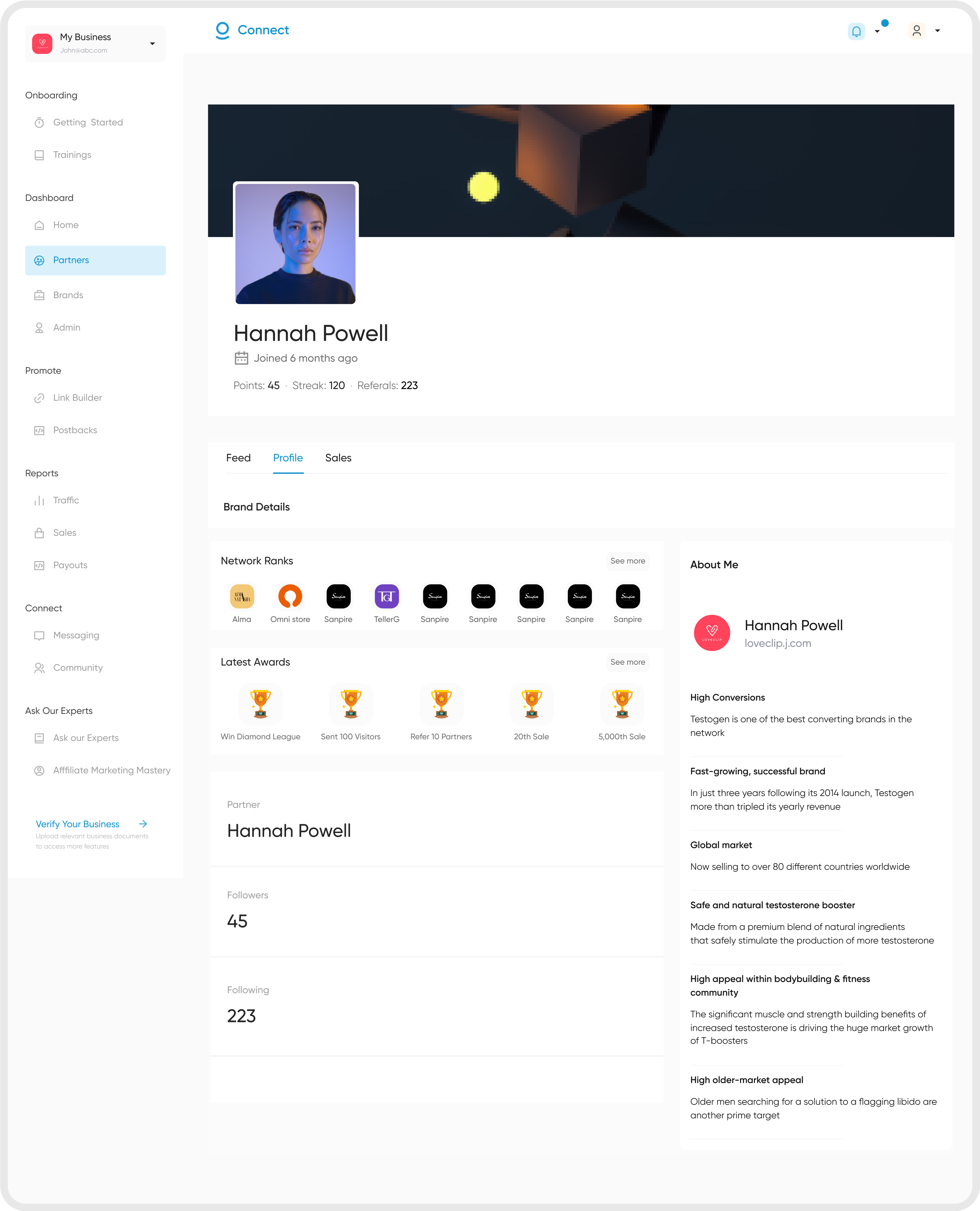
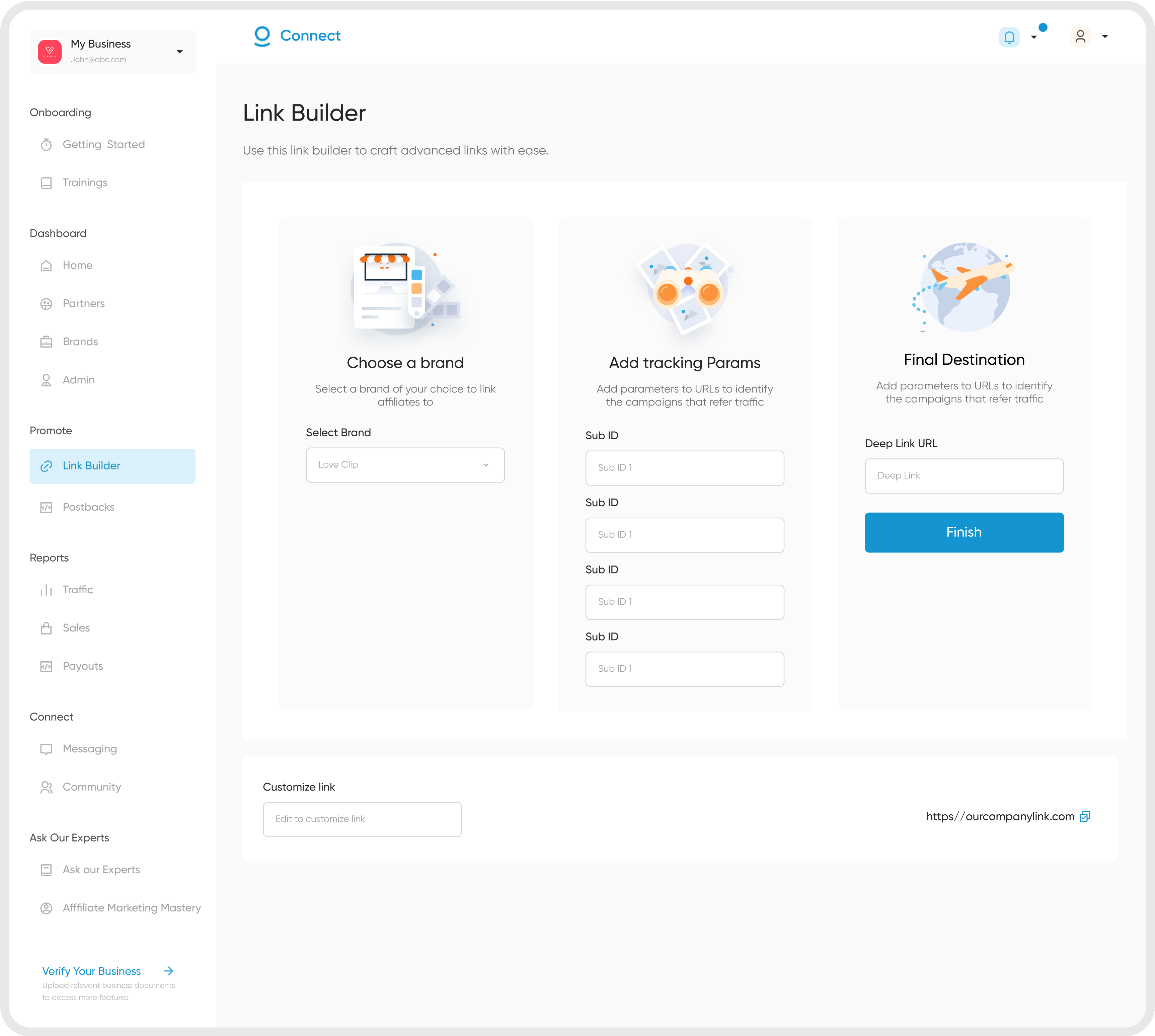
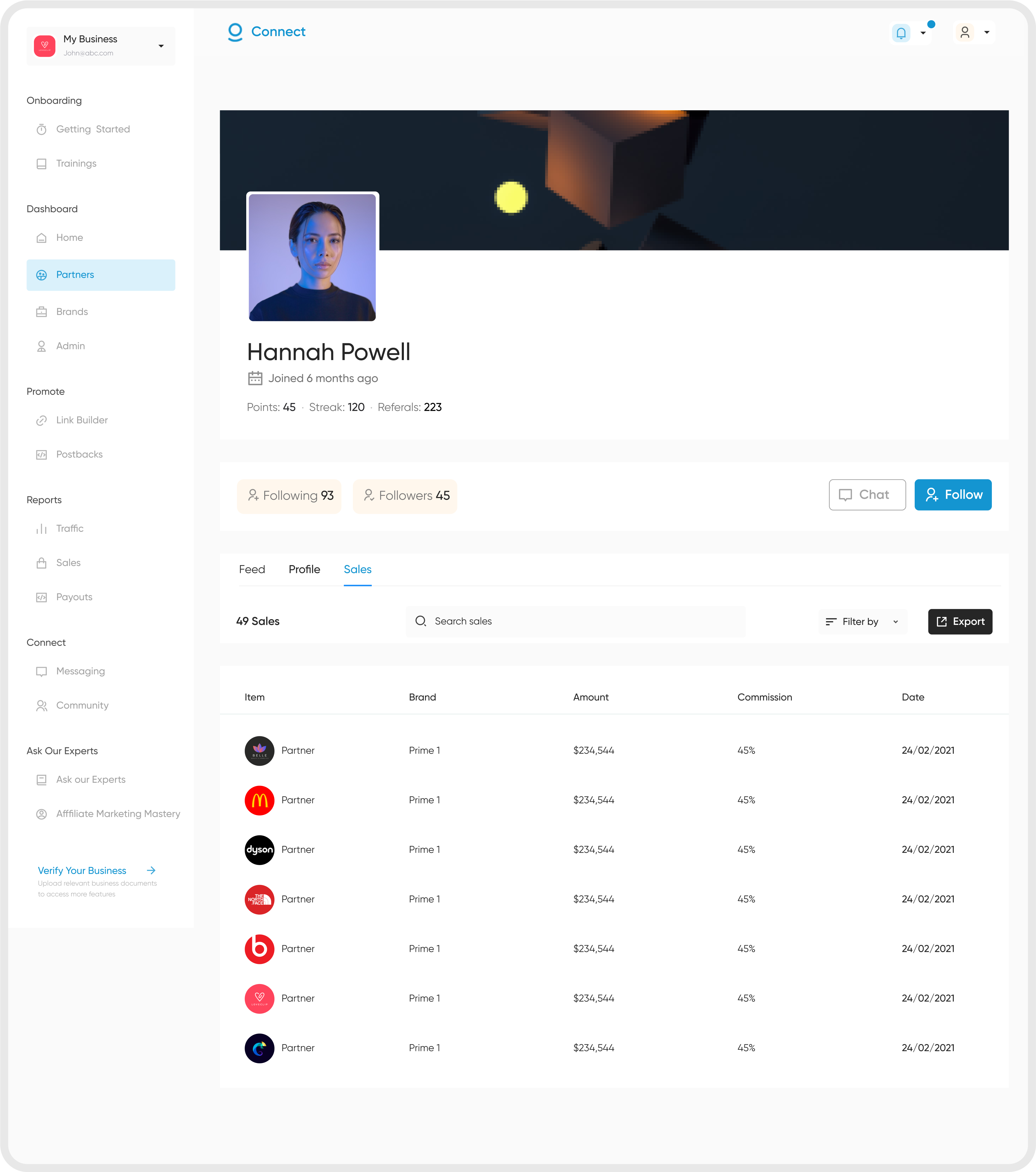
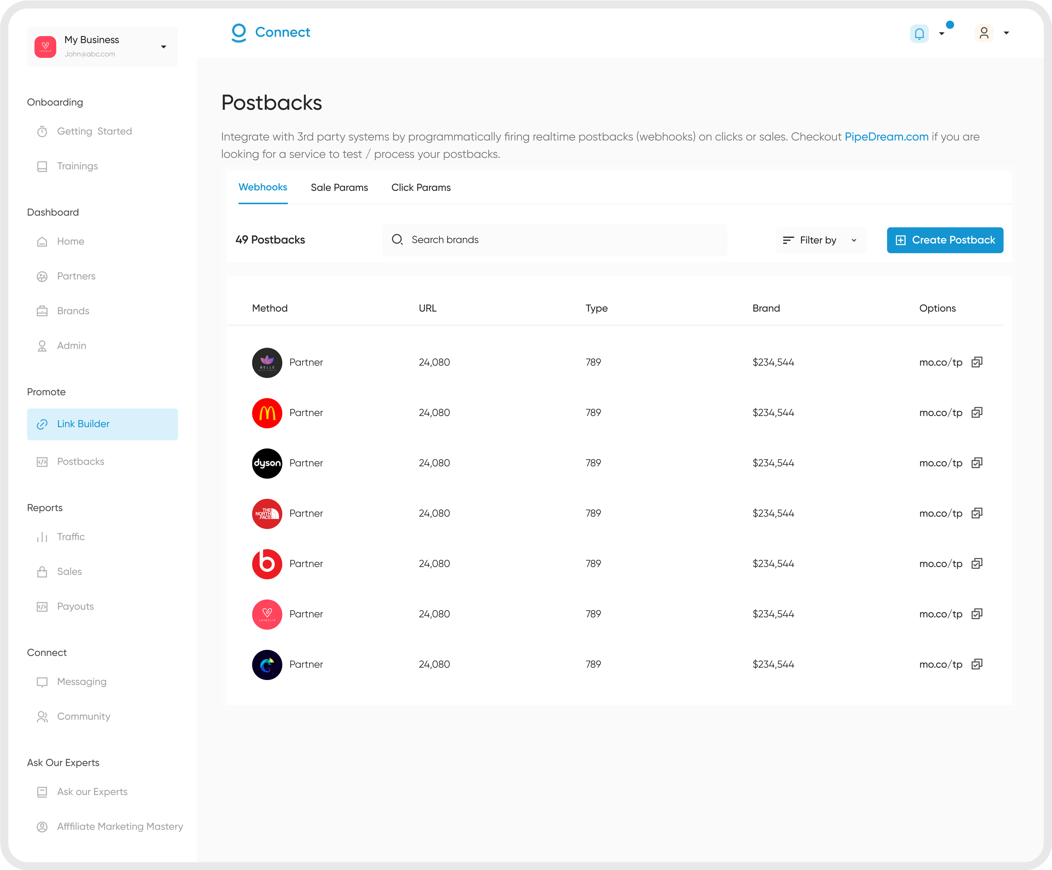
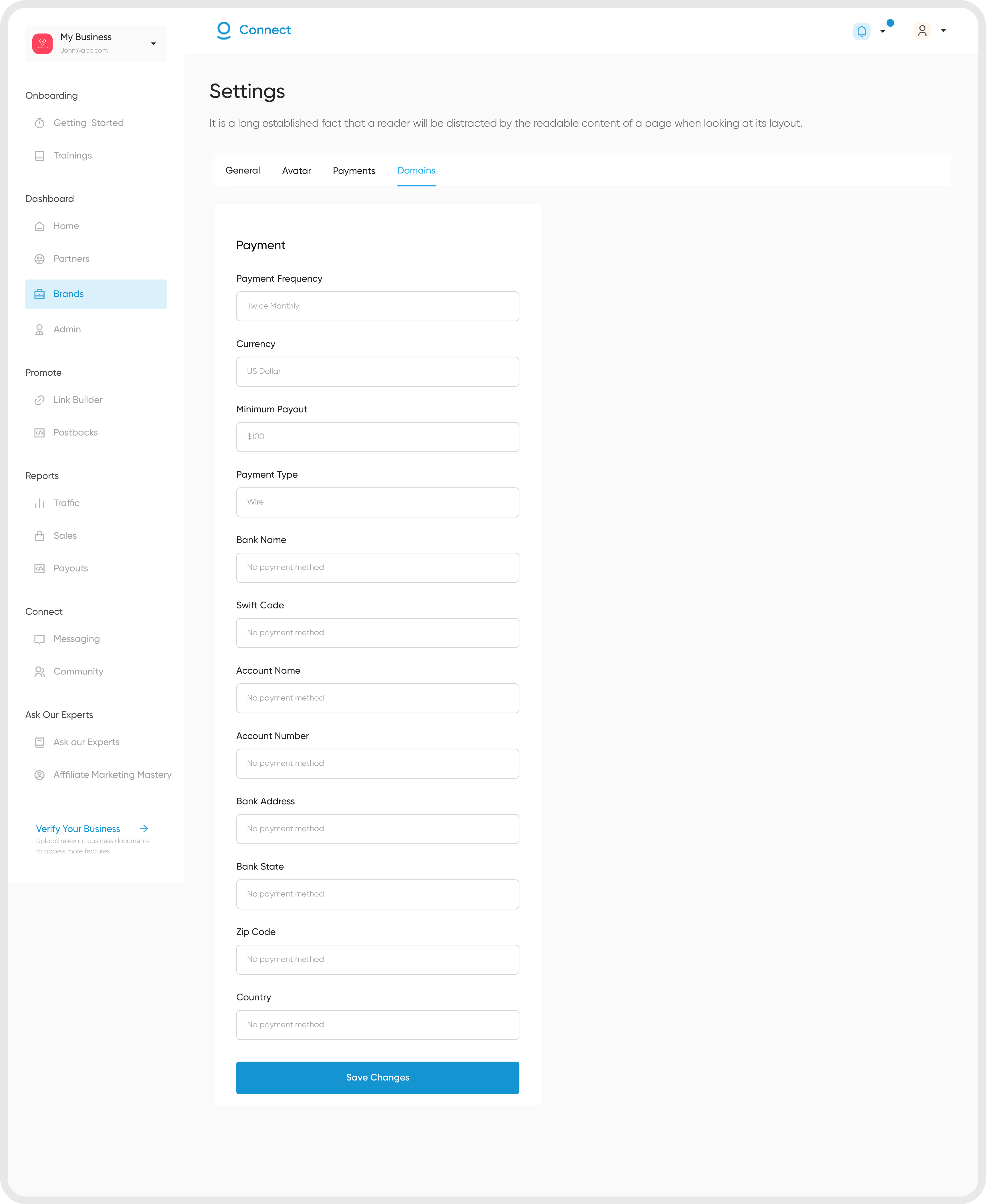
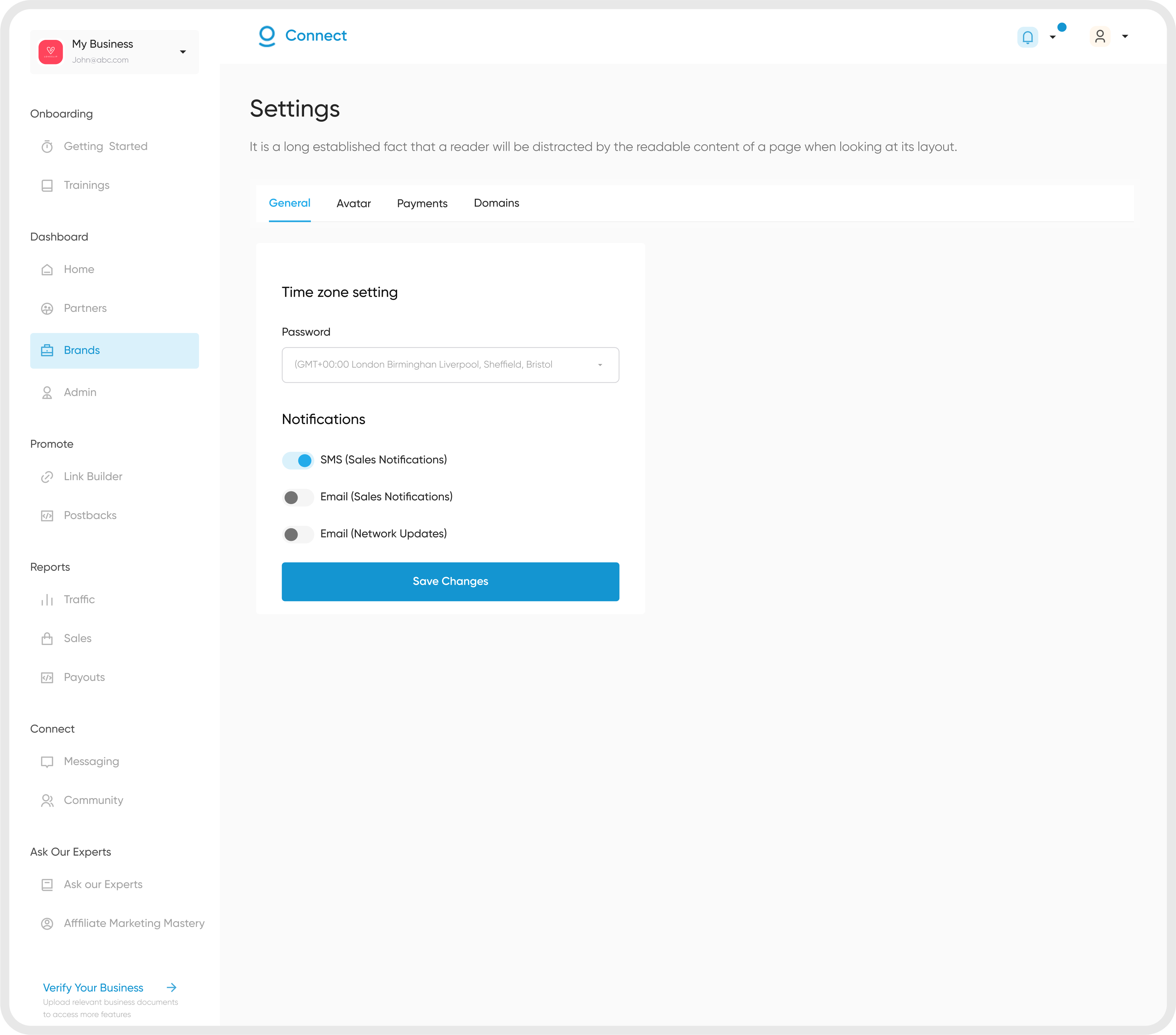
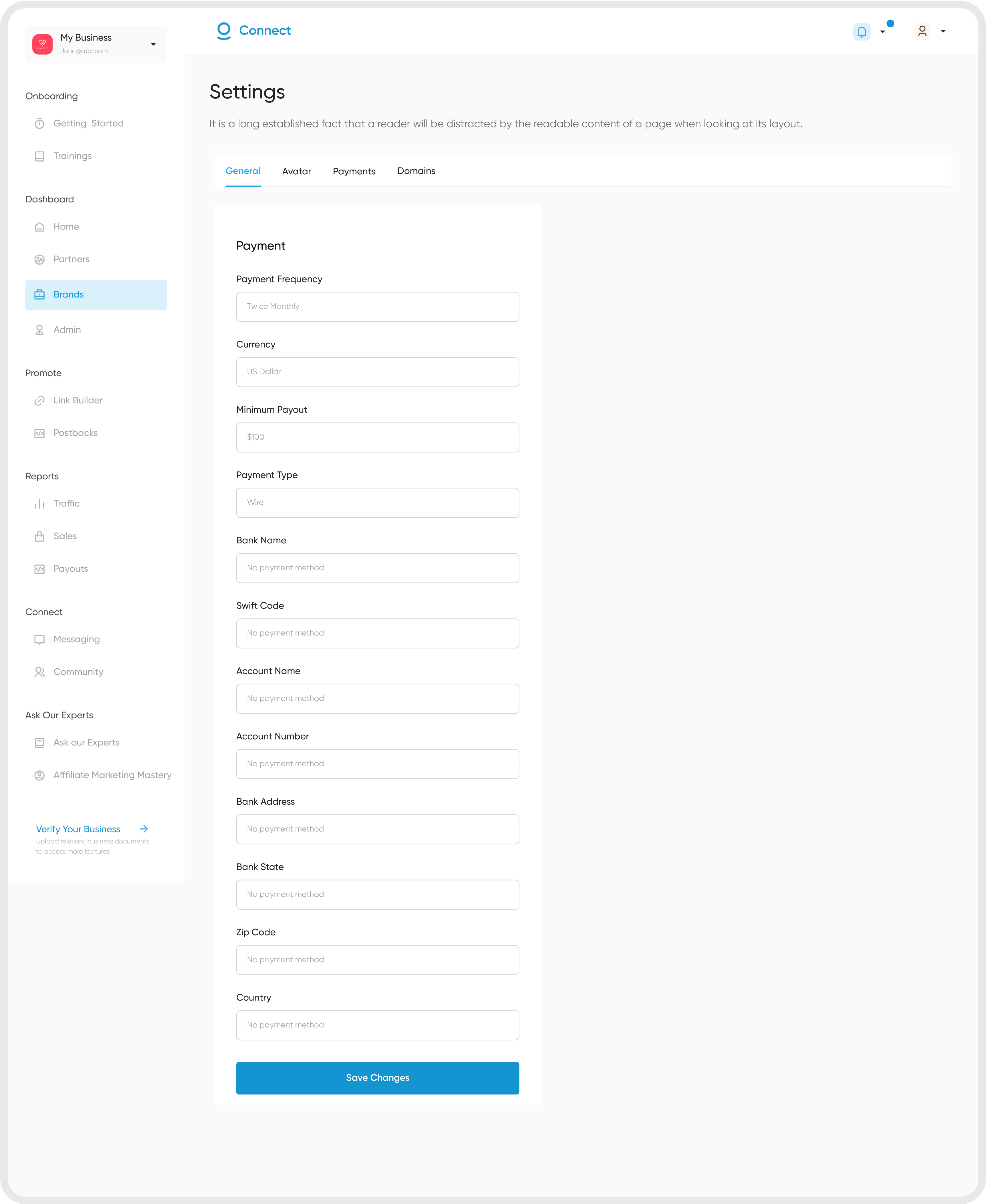
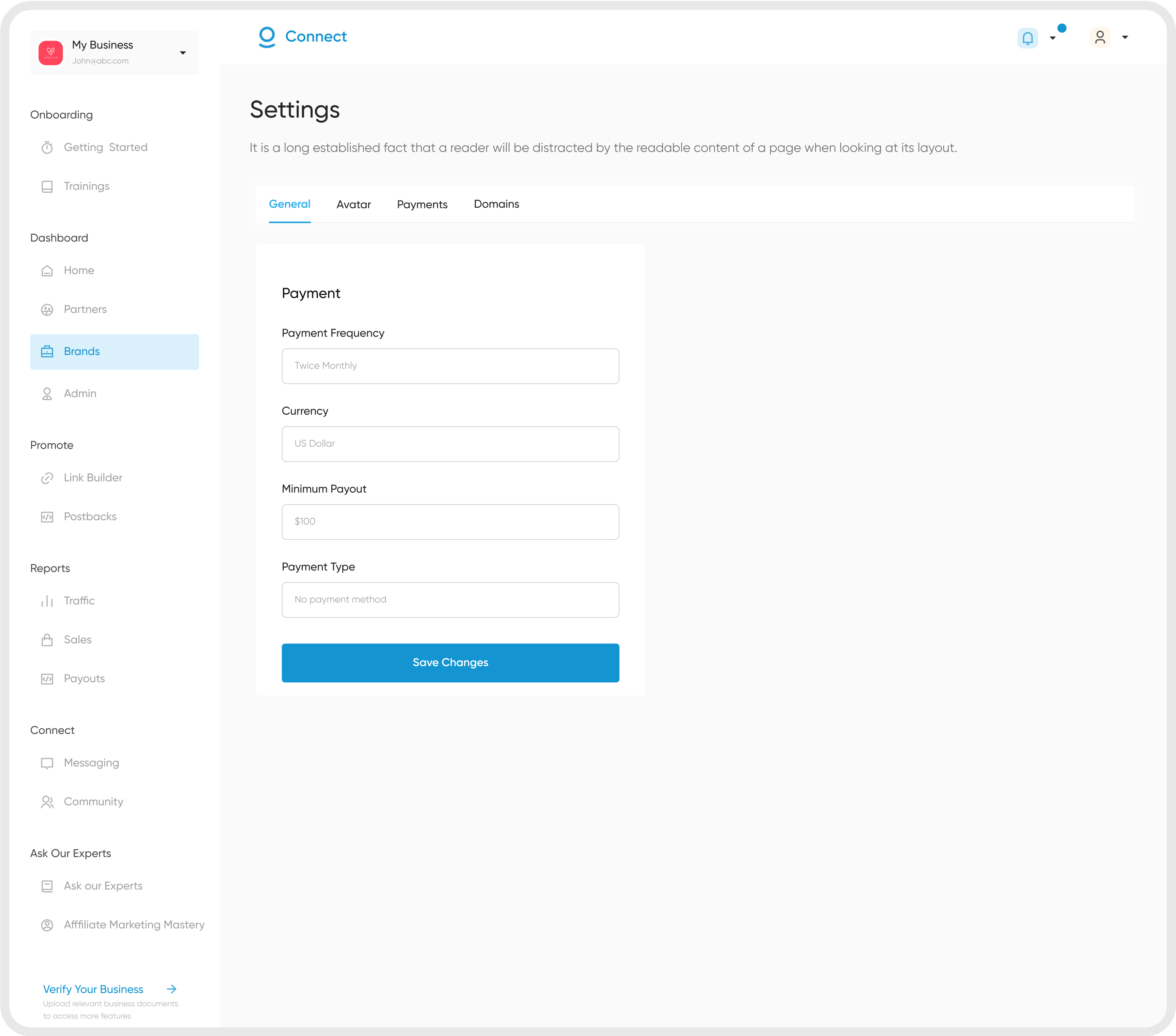
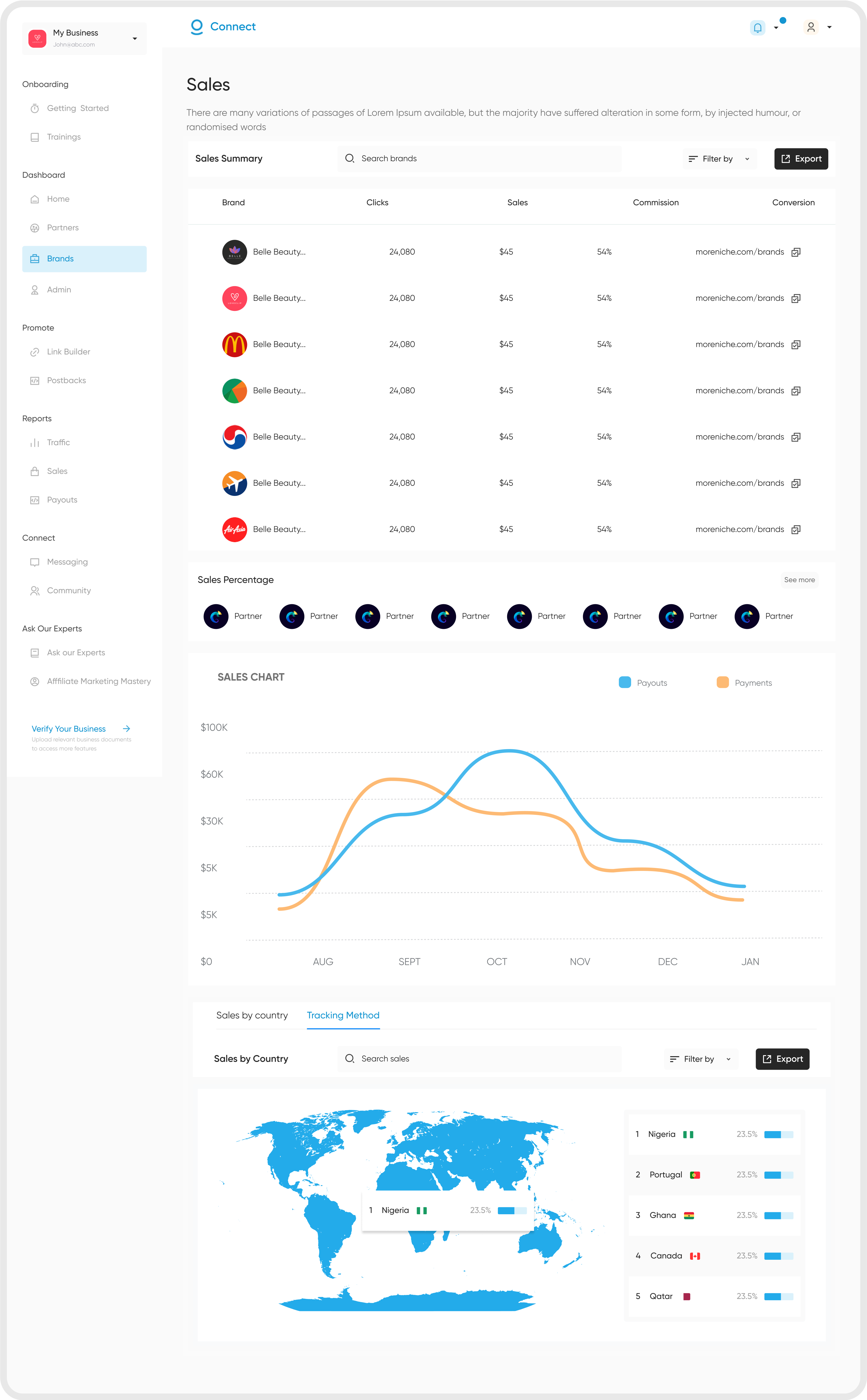
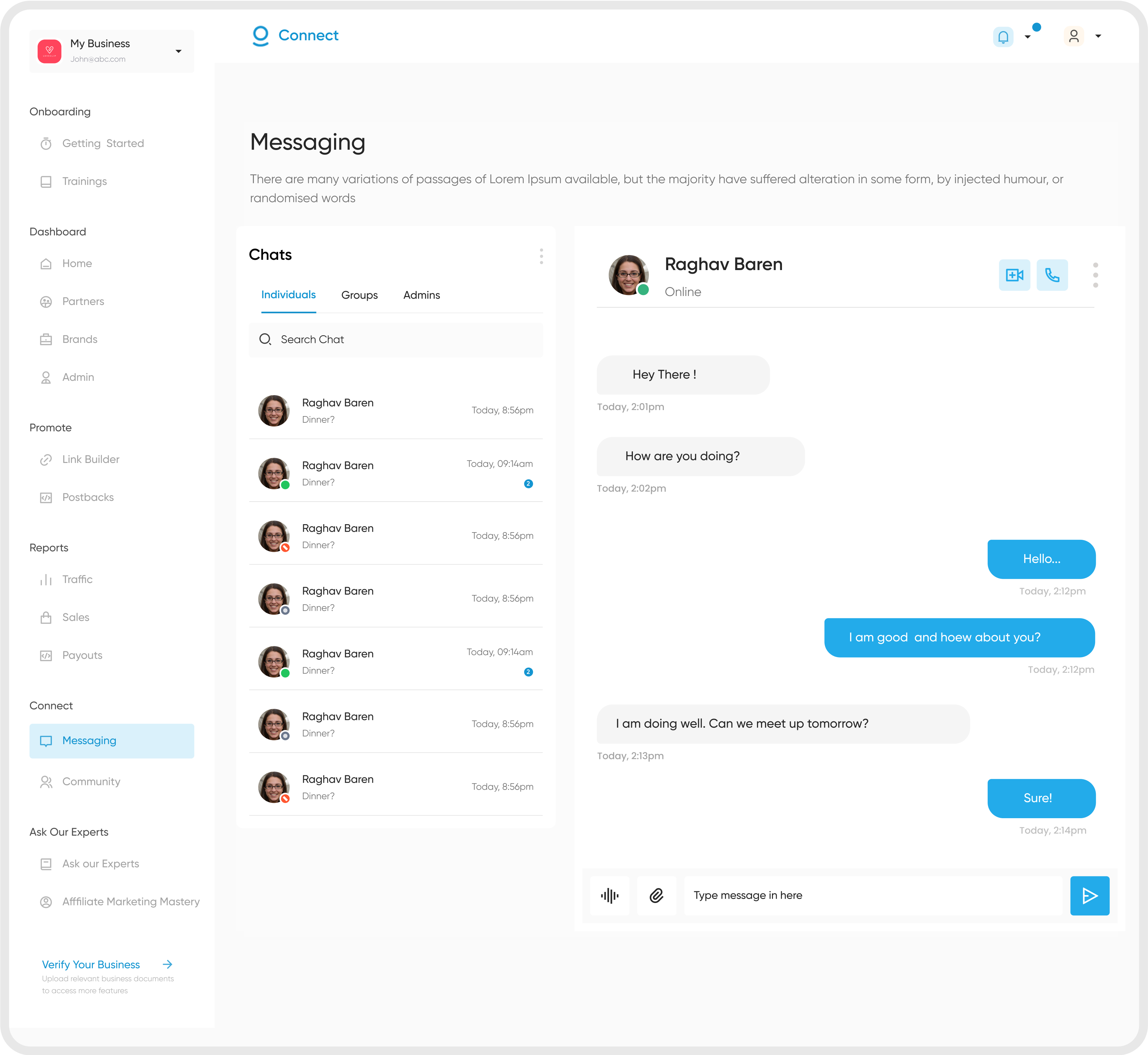
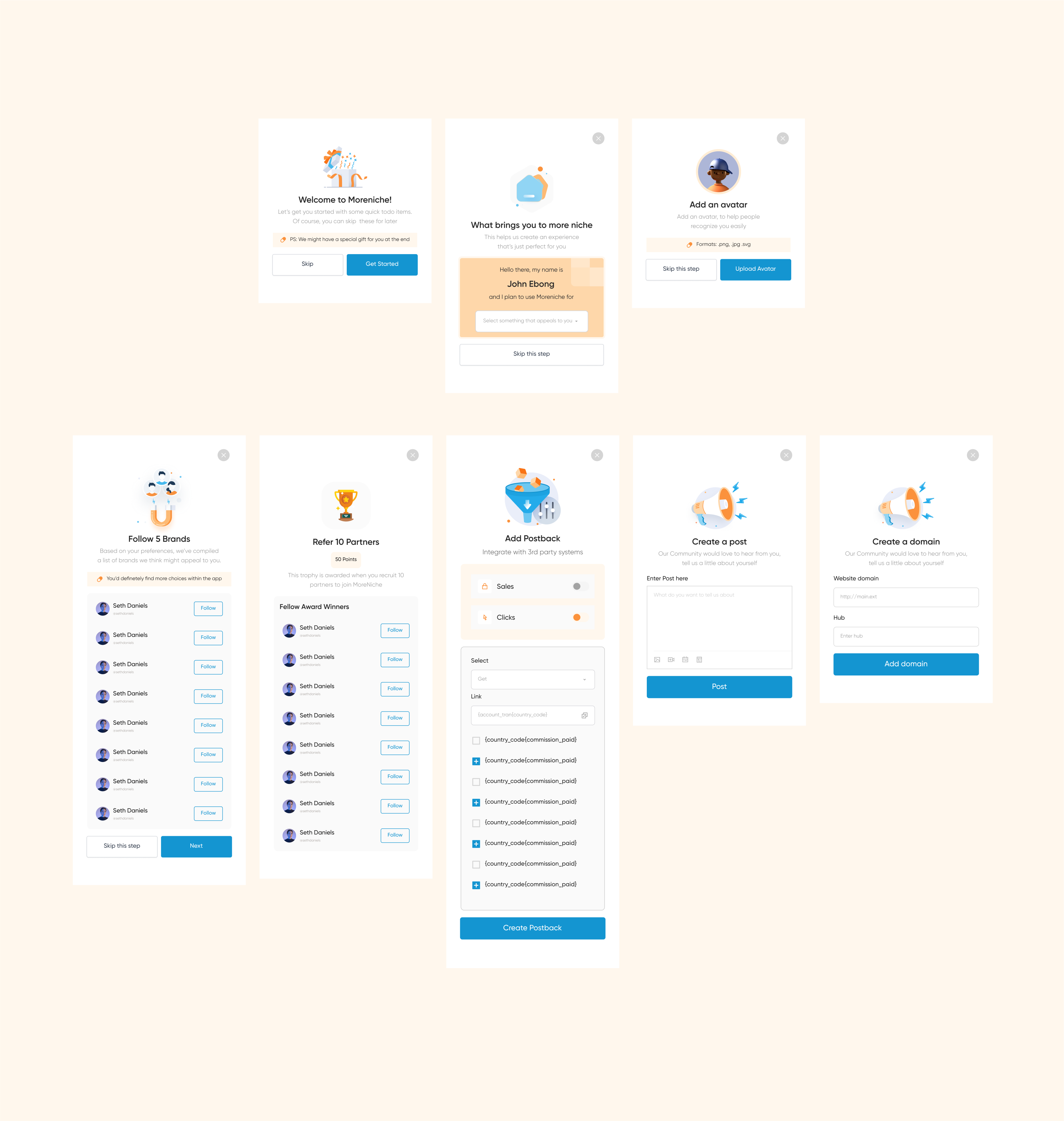
The UI design of the MoreNiche redesign was carefully crafted to be intuitive and simple for users, while also providing all the necessary features and functionality. The dashboard for instance, which serves as the central hub of the platform, provides an overview of key metrics such as traffic, sales, and payouts, and allows users to easily filter and view data by date range.
Additionally, it also provides quick access to important actions such as promoting links, creating postbacks, and accessing reports. The navigation is clear and easy to use, with tabs for the different sections of the platform such as Partners, Brands, and Admin. The use of color and typography is consistent throughout the design, making it easy for users to quickly identify and access the information they need. Overall, the UI design of the redesign is focused on helping users quickly and easily access the information and tools they need to effectively manage and grow their affiliate marketing business.
Conclusion
In conclusion, the redesign of Moreniche was a comprehensive and collaborative effort that aimed to improve the user experience for brands, partners, and affiliates. The redesign aimed to make the platform more intuitive and simple, with the goal of helping users get the most out of the Moreniche business model.
We started by conducting extensive user research, including user interviews, surveys, and usability testing. This helped us to gain a deep understanding of the specific needs and pain points of our target users. We also created user personas to represent different segments of our target audience.
The redesign process was guided by these insights, and we aimed to address the key pain points identified by our users. Specifically, we focused on streamlining the checkout process, making it more efficient, and offering easy integration with popular e-commerce platforms such as WordPress, Magento, and WooCommerce. This would allow merchants to continue using their existing platforms while still enjoying the benefits of a more efficient checkout process, ultimately increasing the chances of sales completion.
We also made changes to the overall user interface, with a focus on simplicity, accessibility, and aesthetics. This was done to ensure that primary functions could be carried out in a click or two, and secondary functions never went beyond one or two layers of interactions.
In addition to these changes, we also improved the reporting and analytics features, which helped merchants to easily track transactions and orders, as well as manage other business-related activities. This all-in-one solution is perfect for merchants who are looking for a way to manage their business efficiently while providing their customers with a seamless payment experience.
Overall, the redesign was a success and we believe that it will help to improve the user experience for all stakeholders, ultimately helping to drive more revenue and success for the platform and its users.
