Introduction
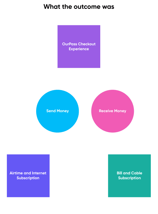
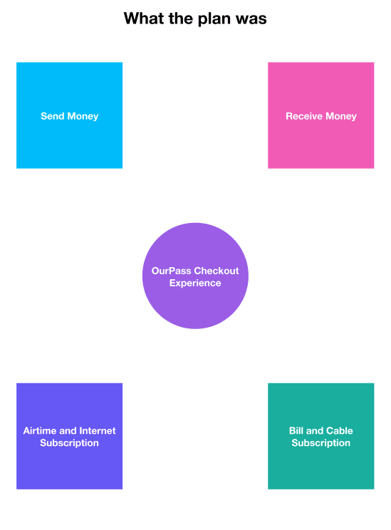
The OurPass Mobile app was designed with a clear goal in mind: to simplify the online shopping experience by streamlining the checkout process for users. Despite its seemingly simple purpose, achieving this objective proved to be a complex task. Nigeria, known for its thriving fintech market in Africa, has a tradition of offering basic features such as sending and receiving money as the foundation for building more advanced features
In keeping with this tradition, OurPass mobile app was designed to provide users with easy access to online platforms that integrated the OurPass Checkout button. This, in combination with the classic send and receive money feature, would expand the app's range of uses. The focus was placed on enhancing the checkout experience while the send and receive money feature serves as an additional function. This was however easier said than done.
Changes
I joined the team with the goal of enhancing the overall user experience of the products offered in the market. However, we soon realized that there was a need to rethink the entire experience of the mobile app, specifically when it came to the checkout process.
After thorough research, including gathering user feedback, it became clear that our concerns were validated. Many users viewed the mobile app solely as another fintech option for sending and receiving money and paying bills, which was not in line with our initial intentions. This realization prompted us to redefine our mission: to redesign the OurPass mobile app to provide a unique and seamless checkout experience for users.
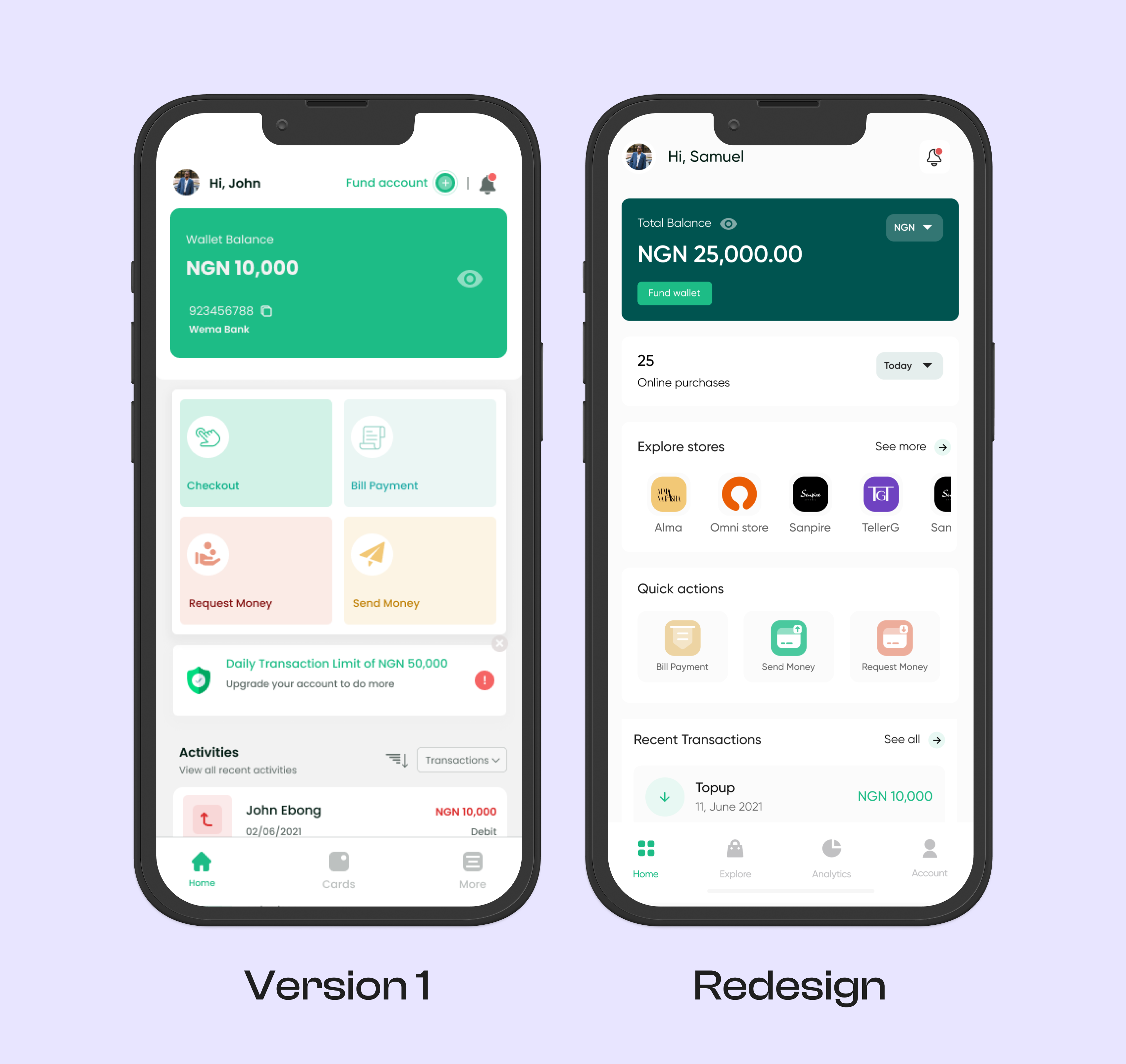
We started by identifying which elements of the existing app were supplementary and which were essential to the checkout process, this helped us determine our priorities. One of the main objectives of the redesign was to simplify the overall user experience. The current app had some unnecessary elements and required more steps than necessary to complete basic tasks. We aimed to address these issues by making the checkout process more seamless and straightforward.
With this in mind, the goal of the redesign became clear:
- Design the OurPass Mobile app to enable one-click checkout for online shoppers.
- Minimize user effort by reducing the number of clicks required for each action.
- Create a visually pleasing and intuitive interface for users.
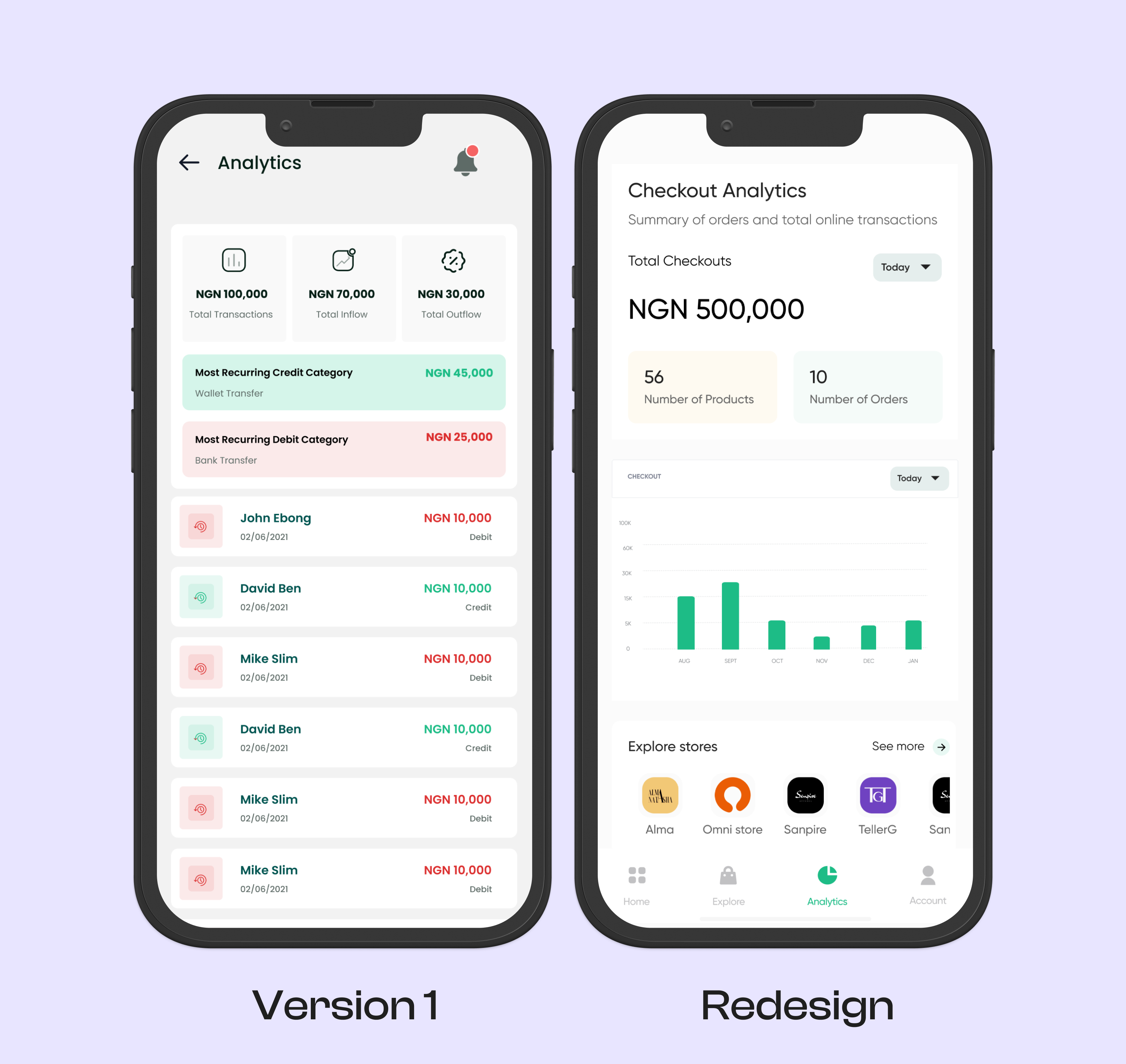
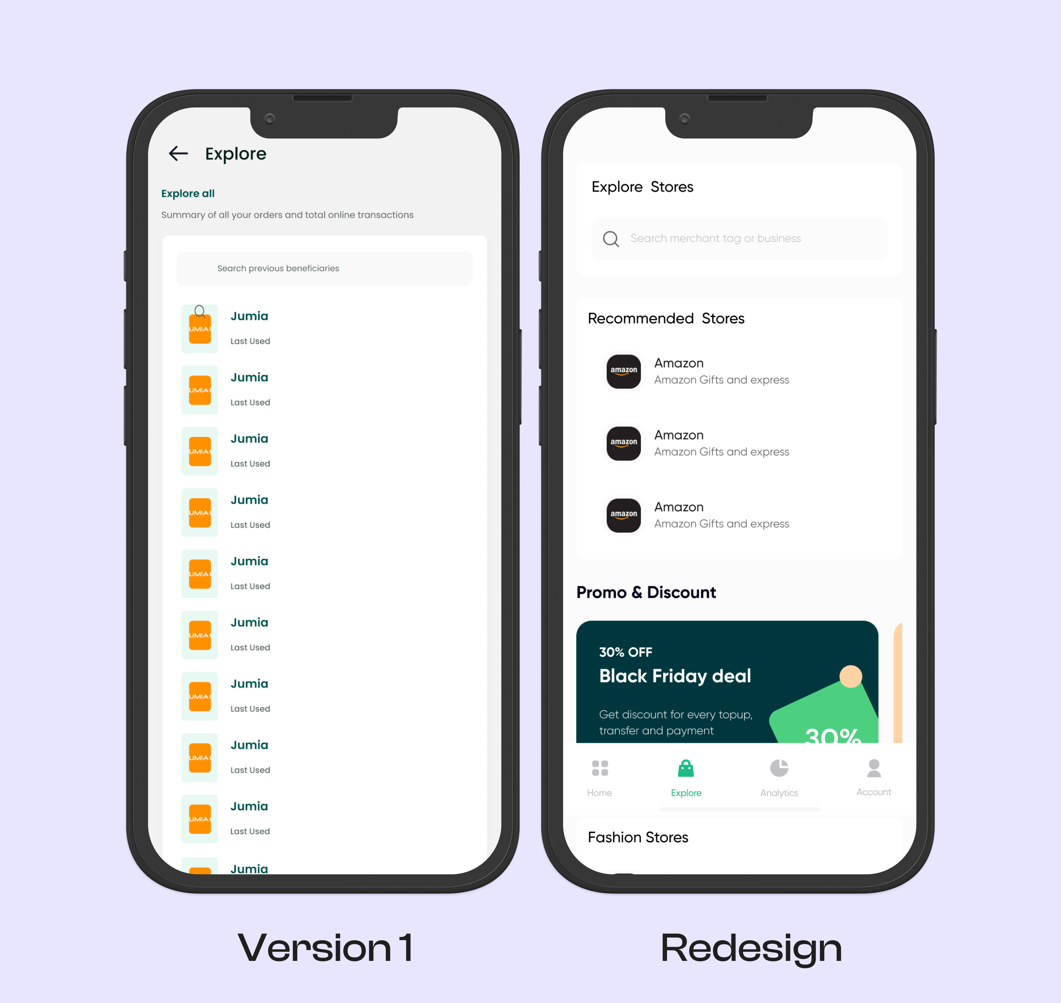
A Visual Comparison Home
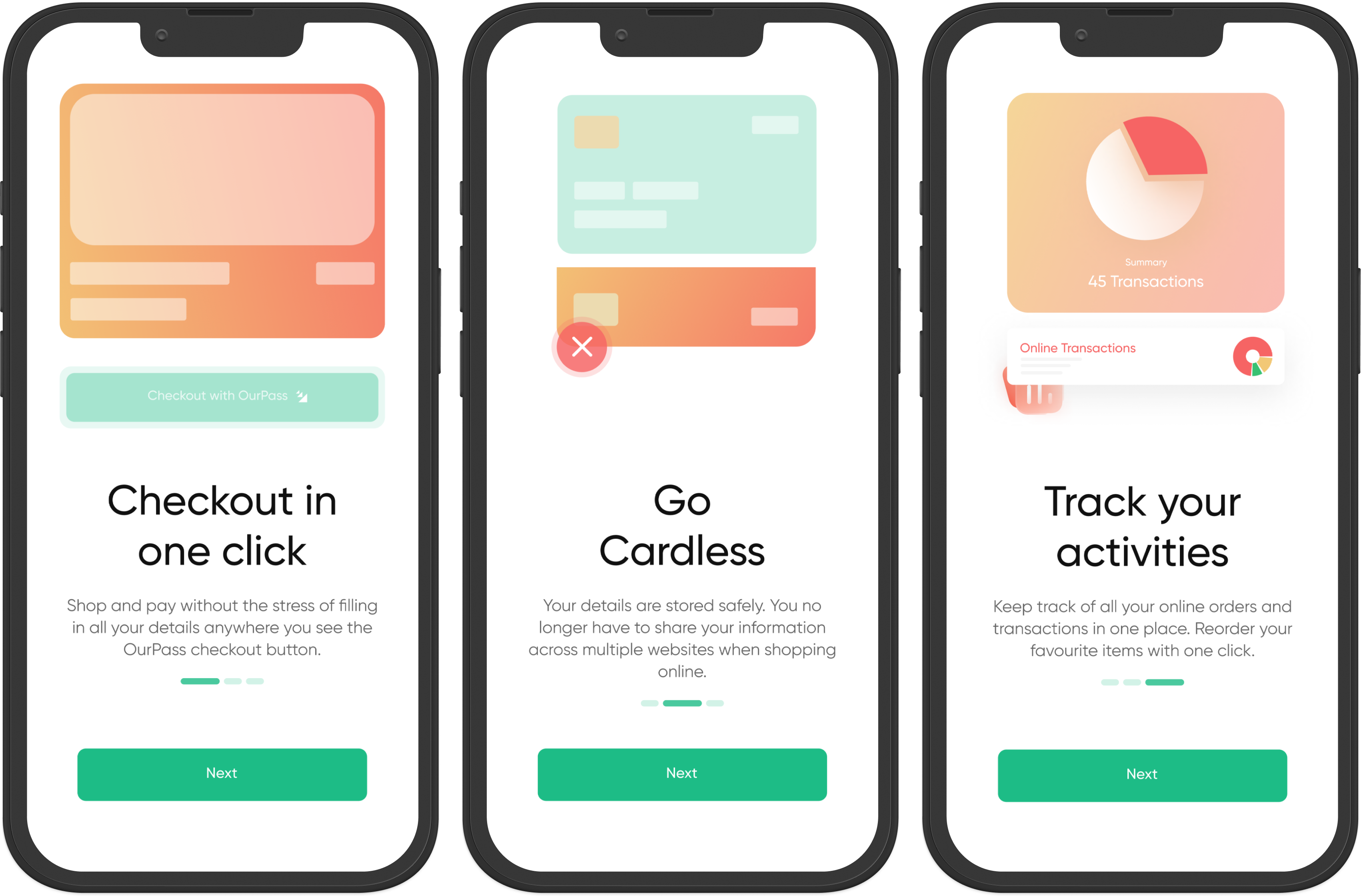
A few screens Onboarding
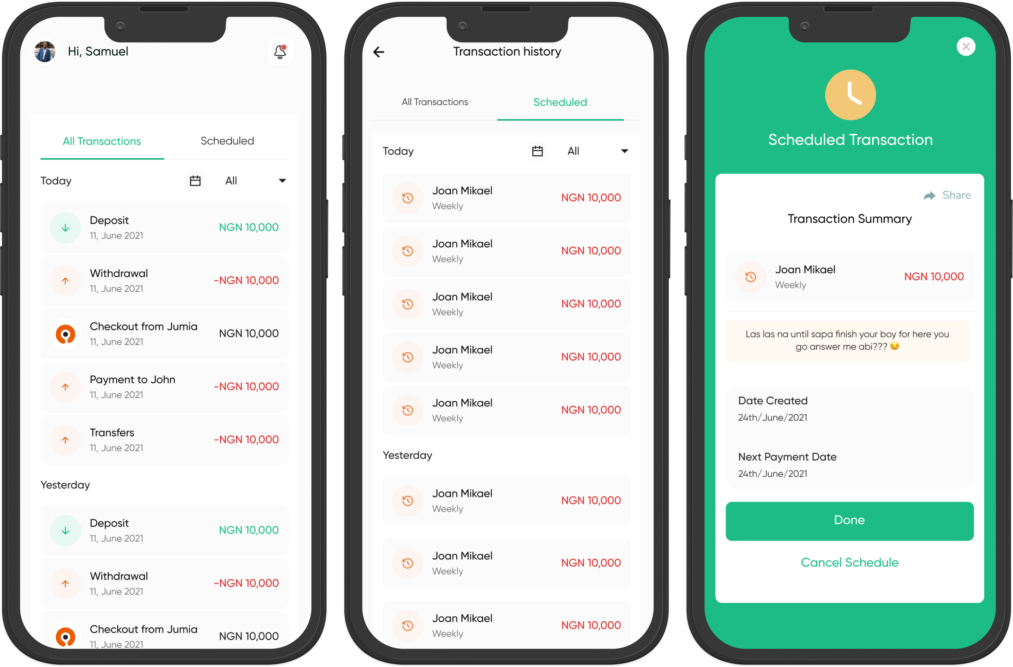
Transaction History
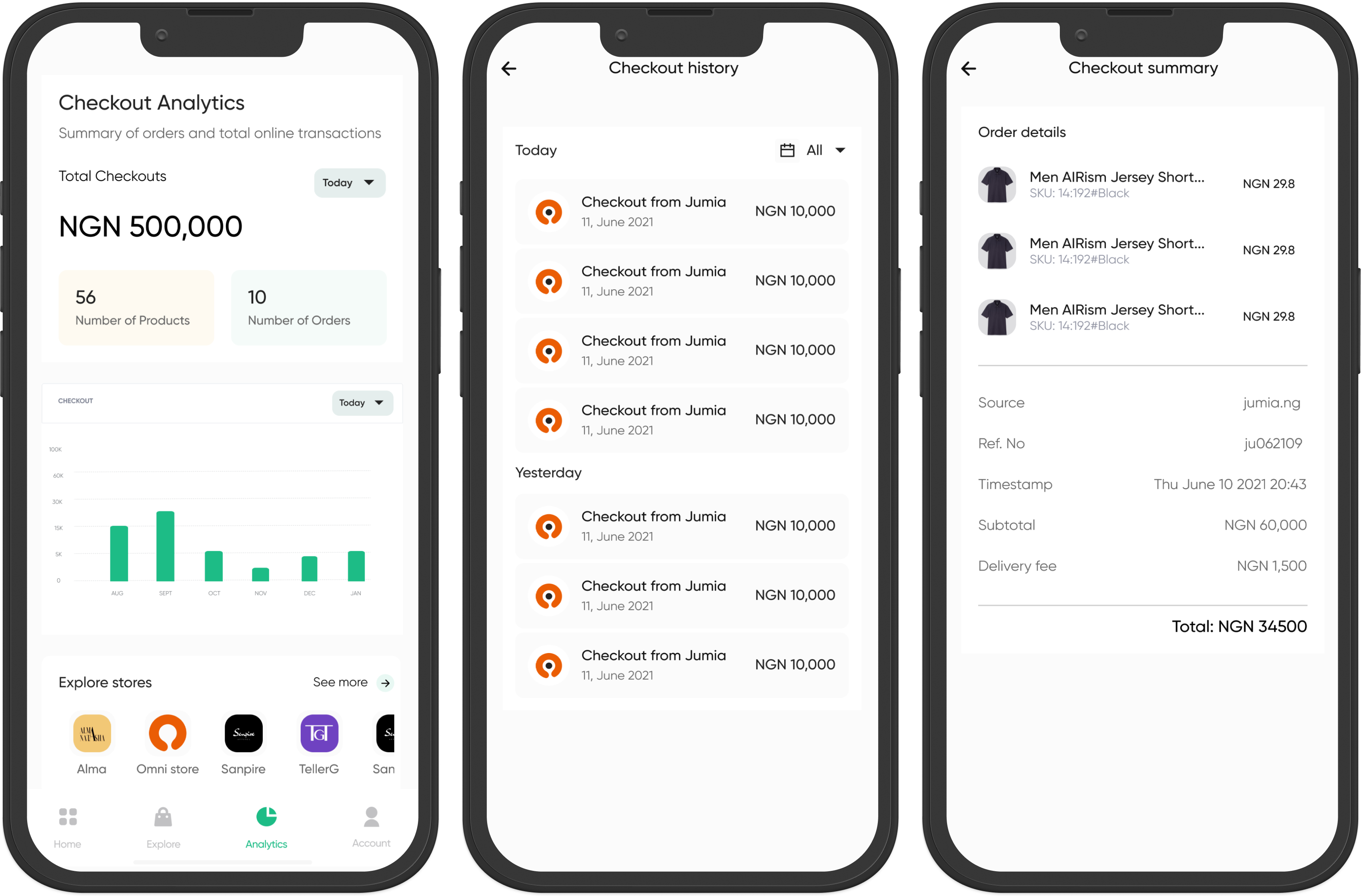
Checkout Analytics and History
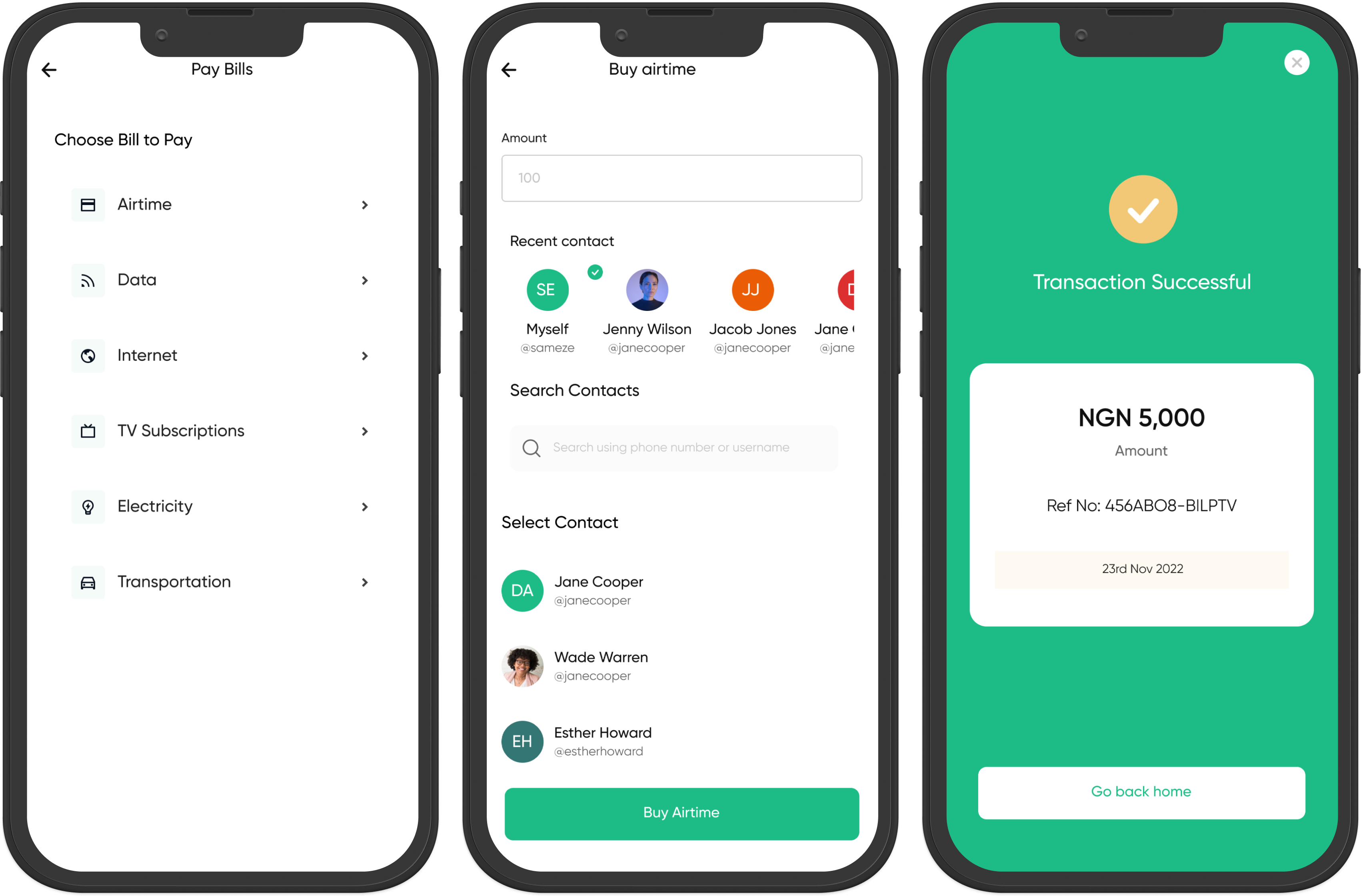
Bill Payments
Checkout Analytics and History
Conclusion
The OurPass Mobile app was recently launched and has received positive feedback from users thus far. Despite this, we recognize that there is always room for improvement and we are actively gathering user feedback to identify any pain points and areas for improvement.
To ensure that we are providing the best possible experience for our users, we have implemented a robust user testing and feedback-gathering process. We are constantly seeking out areas where we can improve the app and make it more user-friendly.
We also have a dedicated team of product designers, developers, and user researchers that work closely together to gather feedback, analyze data, and identify areas of improvement. We also conduct regular user testing sessions to understand how users interact with the app and to identify pain points and potential solutions.
We are committed to making the OurPass mobile app the best it can be and are dedicated to the ongoing process of improvements and updates based on user feedback. We believe that by listening to our users and making necessary changes, we can continue to improve the overall user experience.
